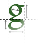
Fonts and text layout need to be chosen carefully on the Web, both to assure good readability and to make sure your page gives the right impression.
Font limitations
On the Web, there is a very limited selection of fonts to choose from. You cannot use just any font you have on your PC, unless you make it into graphics files for headings.
Font choice
Fonts should be carefully chosen to convey the right message. Most "decorative" or distinctive fonts carry a variety of connotations. If you are uncertain in this area, you can play it safe by sticking to the default "plain" sans-serif or serif fonts. (Sans-serif is easier to read for body text on the Web.)
Line length
Lines of text should be a maximum of ten to twelve words long, or readability will suffer.
Line spacing
Increasing the gap between lines can improve readability.
