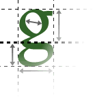
On the Web, sans-serif typefaces are usually more appropriate for body text.
Sans-serif is preferable
Sans-serif text is easier to read than serif text on the Web. This is because the shape of letters with serifs is more complicated and cannot be accurately reproduced at the limited screen resolution.
Different to print
This is the opposite to printed media, where it is often said that serif typefaces are more readable - the serifs provide visual cues that help to determine the shape of the word. This works well in print because there is sufficient resolution to display the (small) serifs.
(In fact, serif typefaces aren't universally considered easier to read, even in print - some studies have shown that users find it easiest to read whichever style of typeface they encounter most often.)
