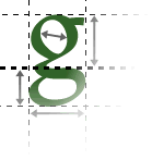
Text is generally laid out in blocks with a certain width. In order to achieve good readability, these blocks should be a maximum of eight to twelve words wide. Lines of text should also be well-spaced.
Width of text blocks
Text blocks should be a maximum of eight to twelve words wide. This is because if the reader's eye has any further to go along the line, it may lose track of the position of the start of the line, and it takes the reader longer to move from the end of one line to the start of the next.
You might need to include a margin at the left in order to make a text block of that width look sensible. For example, this Web site uses a wide left margin.
Line spacing
Increasing the space between lines can improve readability, because this makes it easier for the eye to recognise the gaps and therefore to track back to the start of the next line. Most web pages can benefit from increased line spacing over the default.
Increasing line spacing also carries some meaning; often it can give the impression of a more open, airy, and stylish design.
(You can alter line spacing using a technology known as 'stylesheets' or 'CSS'. Not all visual editing programs support this.)
