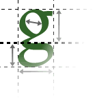
As discussed, there is generally not too much choice of typefaces on the Web. However, where there are decisions to be made (for example when you are making up text as graphics, so any font is available), it's important to make the right choice. Rather than choosing a font that you think "looks good", you should choose one appropriate for the content and meaning of the page.
Meaning of fonts
Fonts are not simply aesthetically different. Each font carries a set of meanings and associations with it, which can be used to reinforce the message of the page.
For example, in general, sans-serif typefaces look modern. Serif typefaces look more old-fashioned or traditional.
Fonts carry other connotations, however. For example, the Microsoft font "Comic Sans" gives an "amateur but friendly" impression. Next time you notice an interesting typeface, look at it and try to think of ways to describe the impression it gives: is it high-quality or cheap? casual or stylish? amateur or professional? rich or poor? conservative or anti-establishment?
This might seem a little excessive, but all these and more are impressions and images that can be conveyed by a good - or poor - choice of fonts.
Impressions from typefaces
Individual exercise
Find an example of a distinctive font. Write down some emotions or impressions that you get from that font.
Playing it safe
If you're not sure of your own aesthetic judgement when it comes to font choices, you can play it safe by choosing one of the standard fonts. These do not carry very much meaning, because they are so widely used, so you can include them on your page without worrying about introducing unintended meanings.
If you were to choose a more distinctive font without understanding the issues, you might end up - for example - giving an amateur image to your professional page, or attiring your church's Web site in fonts more appropriate for a Las Vegas hotel.
Moderation
Fonts should be used consistently and in moderation. Generally, you should use a maximum of two typefaces on a page (one for body text and one for headings), except in special cases. Otherwise your page will look like a gaudy mish-mash of styles.
Even within the same typeface, it's best to restrict the number of different sizes and styles you use. Two or three variations per typeface should be sufficient.
