Consistency
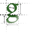
Consistency is vitally important in all areas of graphic design. Any lapses from consistency will tend to create a meaning. This can be used intentionally (e.g. the currently-selected section title could be highlighted in a bold font or in a different colour), but it should be avoided at other times.
Colour schemes
You should choose a colour scheme for the site and stick to it. Colour schemes can be quite simple, with only a single colour plus black and white, or more complex. It's important that your main text is easy to read, which usually means sticking with black on white or something similar.
Images
Any images used on a page should add to the content or style of that page, and fit in with the colour scheme etc. They should be appropriate for the page; arbitrarily-chosen images that are simply there to make the page "more interesting" just look amateur. For this reason, most good images are created or very carefully chosen specifically for a site.
