Consistency is very important in graphic design. Any departure from consistency tends to indicate some kind of meaning. You can take advantage of this to convey information (e.g. highlighting a particular on-screen element), but you should be careful to avoid unintentional inconsistency.
Colour consistency
As discussed, all pages on the site should share a consistent colour scheme. Colour should be used consistently on all pages; if on one page, titles are a particular colour, then they should be that colour on all pages (unless there is a particular reason why not, such as colour-coding for sections).
Font consistency
As mentioned last time, there should only be a few fonts on the site, and each font should be used for a consistent purpose. For example, all level-one headings should generally be in the same font.
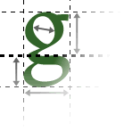
Positional consistency
Graphical elements tend to be "lined up" with each other where appropriate. For example, the top of a news story, and the top of a related photograph, might be lined up.
This also applies between different pages. If the left margin on one page is 100 pixels, it should be 100 pixels on other pages too.
Generally, you can achieve this kind of design consistency by sketching a grid-based design.
Graphical consistency
Sites also look more professional if they are graphically consistent. For example, if a site uses a certain graphic for bullet points, then this should be consistent. Many sites use a graphical motif to give a more distinctive design, with regular repeated elements. (For example, all pages on this site contain a variant of the 'good Web sites' logo from the title page.)